Post by Koda Kumi on Feb 26, 2014 3:19:53 GMT
Welcome ladies to the tenth round critiques. This round, you all paired off to battle one another in either Life or Death.
Let's see how you all did.
Emma - Death

Koda: You've sold me on the theme for sure and it's a striking image. I love your stance. I'm thinking about the angle of the shot here and I'm envisioning it head-on. I think I like that you're not making eye contact with us. I'm looking for something to critique here, but I can't really find anything. Just a really solid shot. Well done.
Jenna: This captures everything you've described, and then some. When I first saw the shot, I immediately thought of standing at the gates of Hell. I think you're embodying all the different aspects that Death can encompass here. I love your pose and your outfit and the styling is simply superb. Altogether, excellent job, Emma!
Jensen: I love this photo. One of my all time faves. You're so fierce and a great model here. I love the darkness and the bars. You definitely look like you're in a graveyard dressed in all black. Also, the bars and emotion also made me think of jail and the death sentence. I am totally in love here!
Portia: I love love love this Emma!!! You did a great job explaining your shot and I definitely can see death here. Everything from the gates to the black dress and hair. I always seem to symbolize black and dark colors with death. Great job!
Jennifer - Life

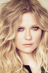
Koda: You've definitely sold your shot well. The colors and the flowers are suggestive of life. I do like the different hairstyle on you. Like Jensen, I do have a slight issue with the quality of the shot, but otherwise, it's a fairly solid representation.
Jenna: I feel as though this is a strong showing here, Jennifer. I like how your interpretation of 'Life' was to surround yourself with flowers. I think that was a creative route to go with. I think you look great here. I have to echo the sentiment of not loving the quality, but that aside this is a solid photo.
Jensen: I agree that representing life is much better than a smiling face. I really like this photo a lot. The fully in bloom flowers are gorgeous and the different colours. Your eyes are shining, I like that too. I'm not fond of the quality though. But otherwise, good job!
Portia: I love the interpretation of life with flowers. I think you nailed the theme there. However, I'm not sure how I feel about YOU here. Your hair is falling on your face weird and your expression is a little plain. I think this is great theme wise but not so great modeling
Kirsten - Life

Koda: Cher pointed out that you look like Martha Stewart and now I can't not see that. Still, I love your energy here and you've given us one of the better descriptions this round to tie the shot into the theme. You do look aged beyond your years, though. I also would have preferred an outfit with a brighter color palette, though. However, overall, I think this is still a fairly good shot.
Jenna: I like how happy and in the moment you are here. You look as if you're genuinely enjoying yourself. I agree, that I wish we could see your face a bit better, though. I do like the way you've described 'Life', as I can see it with what you're representing here. I think you've done a fair job overall, Kirsten.
Jensen: I like this. I love the smile and the setting and whatever is falling. I can't say this is my fave though. Your fingers and hands look like they've been sitting in water and are all wrinkly looking. The shirt is unflattering and your head is just tilted too far back. I really love the smile though.
Portia: Gosh this is so hard. If I would have looked at this photo first I'd say I love it but I've seen other photos and am not sure if this is AS strong as them. You did do well hitting the theme here and looking happy! I do like that about this!!
Milla - Death

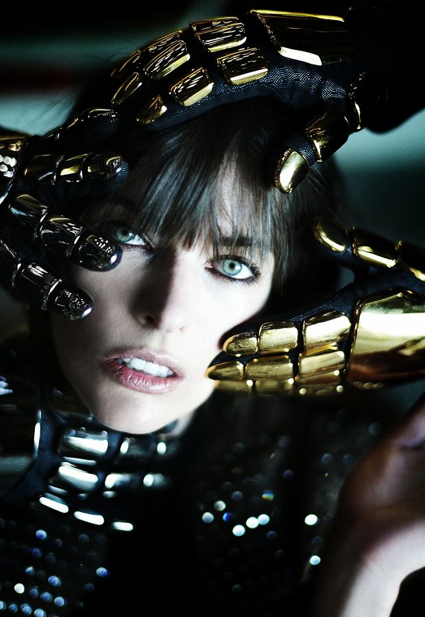
Koda: After I woke up this morning, I was thinking back over the shots that I posted in the Photo Gallery last night. This is the shot I remember most vividly and in the most detail. I love how striking your shot is and how different it is. We may only see your face here, but we have a lot of shots showing off your body, so a headshot is perfectly acceptable to me. I can see the Death aspect of the photo without even reading the description. Fantastic job; I have nothing but positive things to say this round.
Jenna: This is very out of the box, and I think it's excellent. I see exactly where you were going with this. I especially love the vacancy in your eyes, and your stark pale skin against all the darkness is a fantastic contrast. I love your creativity and I think you've executed the theme here in this shot, in a splendid fashion. Great job, Milla.
Jensen: This is gorgeous, and artistic. I love your eyes here. The darkness and thing around your neck definitely say death for me. The hands just all look like they're feeling you up instead of like trying to kill you lol I do love this.
Portia: Ahhh this is awesome Milla! So unique! Not only can I see death here but YOU look awesome. Your eyes pull me in. Amazing
Let's see how you all did.
Emma - Death

Koda: You've sold me on the theme for sure and it's a striking image. I love your stance. I'm thinking about the angle of the shot here and I'm envisioning it head-on. I think I like that you're not making eye contact with us. I'm looking for something to critique here, but I can't really find anything. Just a really solid shot. Well done.
Jenna: This captures everything you've described, and then some. When I first saw the shot, I immediately thought of standing at the gates of Hell. I think you're embodying all the different aspects that Death can encompass here. I love your pose and your outfit and the styling is simply superb. Altogether, excellent job, Emma!
Jensen: I love this photo. One of my all time faves. You're so fierce and a great model here. I love the darkness and the bars. You definitely look like you're in a graveyard dressed in all black. Also, the bars and emotion also made me think of jail and the death sentence. I am totally in love here!
Portia: I love love love this Emma!!! You did a great job explaining your shot and I definitely can see death here. Everything from the gates to the black dress and hair. I always seem to symbolize black and dark colors with death. Great job!
Jennifer - Life

Koda: You've definitely sold your shot well. The colors and the flowers are suggestive of life. I do like the different hairstyle on you. Like Jensen, I do have a slight issue with the quality of the shot, but otherwise, it's a fairly solid representation.
Jenna: I feel as though this is a strong showing here, Jennifer. I like how your interpretation of 'Life' was to surround yourself with flowers. I think that was a creative route to go with. I think you look great here. I have to echo the sentiment of not loving the quality, but that aside this is a solid photo.
Jensen: I agree that representing life is much better than a smiling face. I really like this photo a lot. The fully in bloom flowers are gorgeous and the different colours. Your eyes are shining, I like that too. I'm not fond of the quality though. But otherwise, good job!
Portia: I love the interpretation of life with flowers. I think you nailed the theme there. However, I'm not sure how I feel about YOU here. Your hair is falling on your face weird and your expression is a little plain. I think this is great theme wise but not so great modeling
Kirsten - Life

Koda: Cher pointed out that you look like Martha Stewart and now I can't not see that. Still, I love your energy here and you've given us one of the better descriptions this round to tie the shot into the theme. You do look aged beyond your years, though. I also would have preferred an outfit with a brighter color palette, though. However, overall, I think this is still a fairly good shot.
Jenna: I like how happy and in the moment you are here. You look as if you're genuinely enjoying yourself. I agree, that I wish we could see your face a bit better, though. I do like the way you've described 'Life', as I can see it with what you're representing here. I think you've done a fair job overall, Kirsten.
Jensen: I like this. I love the smile and the setting and whatever is falling. I can't say this is my fave though. Your fingers and hands look like they've been sitting in water and are all wrinkly looking. The shirt is unflattering and your head is just tilted too far back. I really love the smile though.
Portia: Gosh this is so hard. If I would have looked at this photo first I'd say I love it but I've seen other photos and am not sure if this is AS strong as them. You did do well hitting the theme here and looking happy! I do like that about this!!
Milla - Death

Koda: After I woke up this morning, I was thinking back over the shots that I posted in the Photo Gallery last night. This is the shot I remember most vividly and in the most detail. I love how striking your shot is and how different it is. We may only see your face here, but we have a lot of shots showing off your body, so a headshot is perfectly acceptable to me. I can see the Death aspect of the photo without even reading the description. Fantastic job; I have nothing but positive things to say this round.
Jenna: This is very out of the box, and I think it's excellent. I see exactly where you were going with this. I especially love the vacancy in your eyes, and your stark pale skin against all the darkness is a fantastic contrast. I love your creativity and I think you've executed the theme here in this shot, in a splendid fashion. Great job, Milla.
Jensen: This is gorgeous, and artistic. I love your eyes here. The darkness and thing around your neck definitely say death for me. The hands just all look like they're feeling you up instead of like trying to kill you lol I do love this.
Portia: Ahhh this is awesome Milla! So unique! Not only can I see death here but YOU look awesome. Your eyes pull me in. Amazing


